Refactoring a Design System

Overview
Project
When stepping into a new role, it is not uncommon to encounter an already established design system. While such systems lay the groundwork for consistent design across a platform, experience often reveals areas where improvements can be made to enhance them. Re-engineering an existing design system is no easy task. With lots of detached components, and themes already in use, striking a balance between creating new elements, modifying existing ones, and even eliminating some entirely becomes a large and difficult undertaking.
Since its inception in 2020, the design system has proven its worth with extensive usage. However, over time, Figma has introduced improvement after improvement, with new features that significantly enhance workflow and efficiency, including Nested Instances and variables. Unfortunately, the design system has not been updated to align with this new feature set, leaving a lot to be desired. By neglecting to upgrade the design system with these advancements, the system has missed out on significant opportunities to streamline processes and maximize efficiency.
Challenge
I saw a few ways to tackle the design system:
Completely revamp it from top to bottom.
While this sounds appealing, it really is a large task, which involves multiple people to accomplish successfully. All components to needed to exactly match to not interrupt other files depending on it. When the dev team is still using these files, and delivery is still a main focus of the business, this did not seem to be the correct course of action.
Incremental component updates
This idea was less abrasive, and would concentrate on building components as they are being designed, overwriting the old components. I saw this as a much better way to update the current design system. It doesn’t interrupt current workflows nearly as much, but also would be a much slower path to completeness
Build an adjacent Design System
This would allow the creation of a design system separate to the existing system. Then, when it is completed, to move all new designs to a new system.
I decided a careful blend of updating components over time, and building an adjacent design system would be the most effective route. When I created or updated components from the old design system, I would move them over to a new design system which I named Lighthouse.
The real challenge of this project was getting management and dev collaboration, as a designer cannot implement a design system for a global product alone. I identified 6 key reasons why this was required for the business to keep growing when spanning a sleuth of different projects and initiatives.
Well.. Why?
Platform to production parity
Our platform to production parity was pretty bad – it was very hard for QA to do their job without giving them a 1-1 representation of what to expect. This in turn increases the time it takes to do their job. Dev also had a hard time, with mismatched colours and naming and comprehensive component representation.
Components
Components had no real authority – we had no differentiation for local and global components.
Design Tokens
The use of our colours were not semantic. We are not able to use colours to their full potential. Also, if we decided to update colours across the board, it would prove an impossible task – so accessibility features (like a high contrast mode) would not be possible.
Accessibility
We often heard feedback about colour contrast across the product. It was costly to identify every colour which was not tied to a token, so changing them became a case by case basis.
Documentation
The design system had no documentation, for colours, typography or components. This becomes a problem when trying to decipher what elevation to use, or what is the suitable typography style for a new design.
Maintenance
Keeping the design system updated alongside production was impractical. Again was something that had to be completed on a case by case basis.
The Process
Discovery
I started the process by fully evaluating the current design system, and taking inventory of the components we had. I made a list of all of the components, colours, and type styles. I broke all of these down to the atomic level, to identify what was required for completion.
I also spent some time talking to all of the different teams that interact somewhat with the design system. This included development, QA, and solution owners.
What i understood is that how the current design system functioned, it created a lot of inefficiencies across the teams. Dev had to recreate components a lot, and hunt for some undocumented colours, QA had to always look through the Figma files to see if a component was correctly created, and solution owners consistenly had feedback about accessibility issues.
Tools
I used a variety of tools to help me build the foundations of the design system. Adobe Leonardo for colour palette and contrast help, CSS font clamp to help adjust typographic sizes, we introduced StoryBook which was a huge help in creating design & dev parity. Token studio to help manage colours in Figma, and a few other tools and plugins.

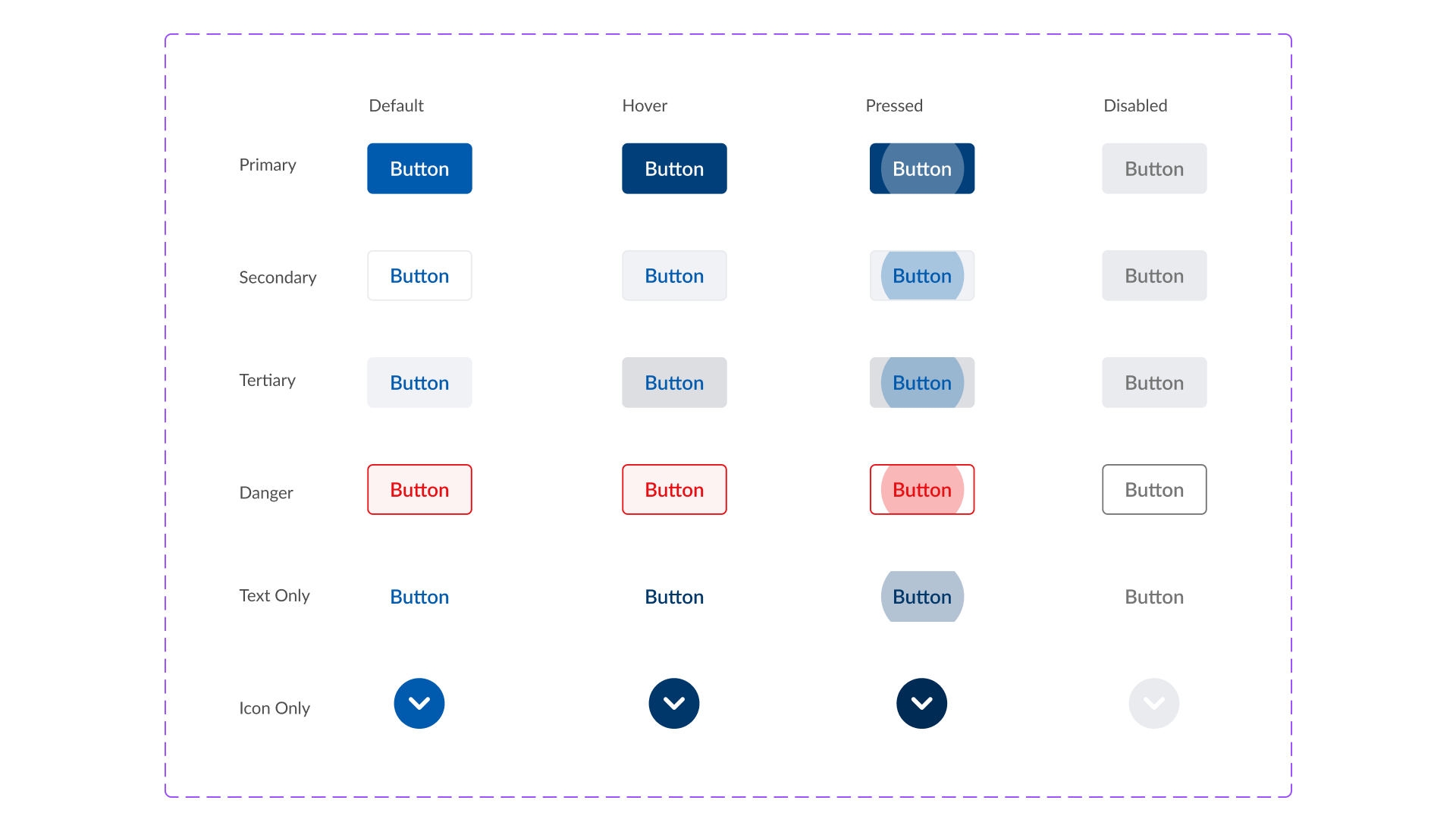
An example of the button component from the old system to Lighthouse. With the introduction of variables and nested instances, i was able to reduce and simplify the amount required to do the same job (even including a pressed state).
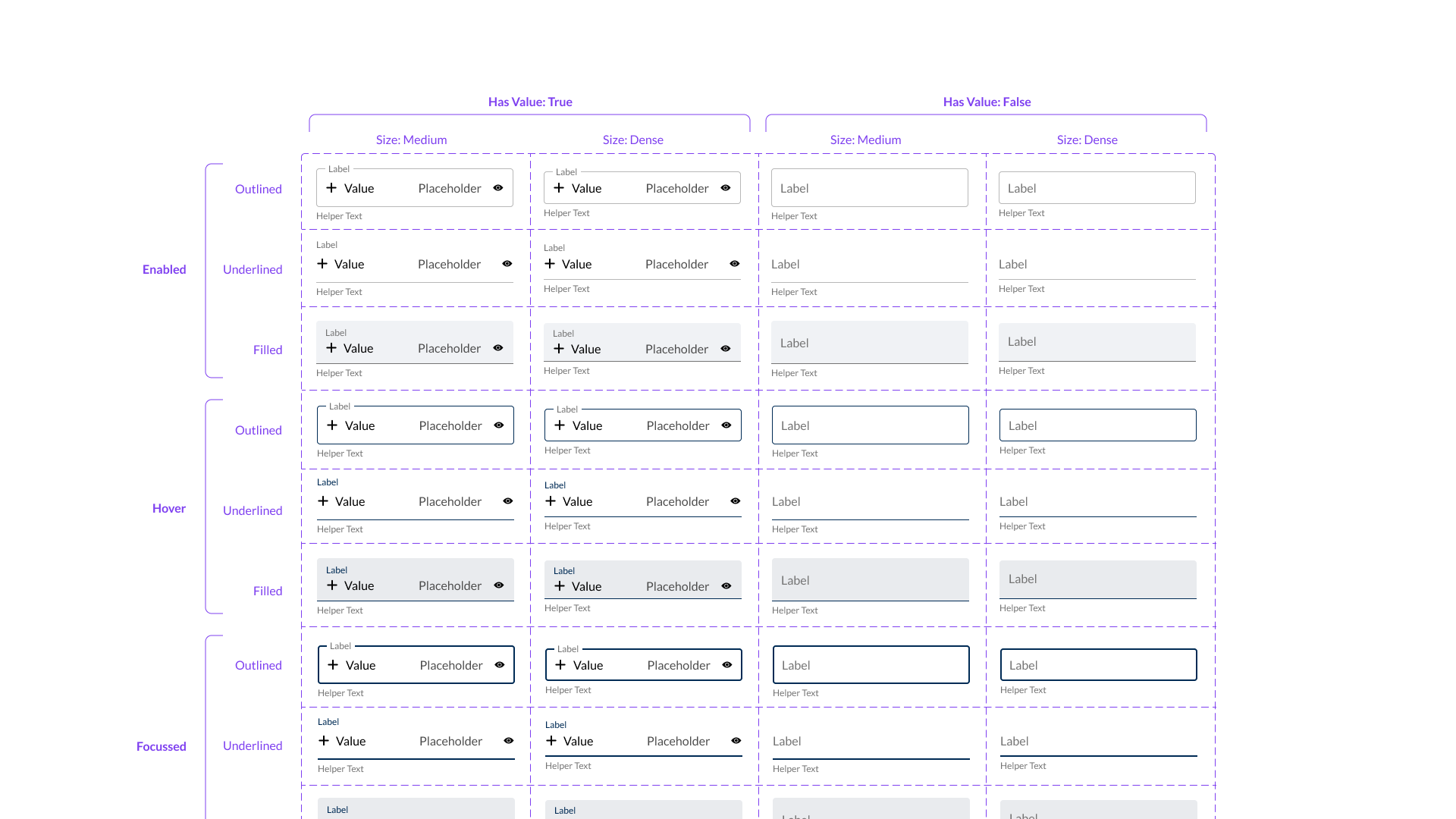
Refactoring the inputs based on MUI.
The Solution
So Far
So far i’ve rebuilt 64 components, added 24 colours and 3 typographic styles. I’ve added documentation for all of these components. I’ve integrated these components with the StoryBook equivalent, to ensure dev has the most up to date versions.
Due to the implementation method, this is an ongoing project, and components are being changed, added and updated regularly to build the system, until the old system has been phased out.
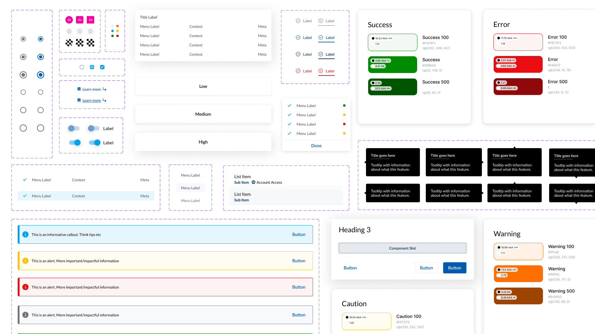
An assorted collection of colours, typography and components from Lighthouse.