Self Study: Google UX Course

Overview
Project
I’ve been doing a lot of thinking lately and I’ve made a decision to switch my career path towards something more suited to UX/UI. It’s an exciting change! As part of this journey, I’ve taken up the Google Design UX course, which allows me to dive into real-world research and design.
Since I’m currently in the midst of the course, I’ll be updating this project at every step, which means that the case study isn’t fully complete just yet.
To kick things off, I used Sharpen to generate a brief for the design course. The brief I received was to “Design a movie trailer app for a local movie theatre.” To make it more meaningful, I decided to provide some context by basing it on an actual local theatre.
Problem
My local movie theatre is eager to develop a mobile app that caters to the needs of movie enthusiasts in our community. They want to create a user-friendly experience that simplifies the movie selection process and enhances intuitiveness. The app should allow users to search for movies, book tickets, and stay updated with the latest and upcoming releases.
During my exploration of this project, I identified a couple of key issues that needed attention:
- Users were feeling overwhelmed by the extensive range of movie options available to them.
- Some users faced accessibility challenges when trying to purchase tickets.
To tackle these challenges, I began the design process. I employed various research techniques to gain a deep understanding of the target user group I was designing for. This involved conducting face-to-face interviews, distributing questionnaires, and reviewing existing research.
Prior to embarking on this project, I hadn’t fully grasped the potential difficulties that users might encounter. As someone who frequently watches movies, I had always found the process of selecting and booking movies relatively straightforward. However, delving deeper into the user experience, I discovered several pain points and frustrations that users could potentially face, even in something as seemingly simple as searching for movie trailers. The research I conducted provided me with valuable insights into how users feel and navigate through these challenges, allowing me to address their needs more effectively.
Competitive Analysis
During the research phase, I dedicated some time to conducting competitor analysis. This involved identifying products that were either directly or indirectly similar to the one I was designing. By examining these products, I was able to gain valuable insights into what they excelled at, what they were just okay at, and areas where they fell short.
Analyzing the competition proved to be incredibly beneficial, as each product I looked into had its own unique approach and offerings. This allowed me to learn from their successes and shortcomings, helping me shape my own design strategy with a broader perspective.
Understanding the user
I adopted the design thinking process, placing a strong emphasis on empathizing with the user. In order to understand the habits, challenges, and aspirations associated with discovering movie trailers, my approach involved conducting interviews and engaging potential users in thoughtful discussions.
For this particular project, I had the opportunity to interview six individuals, ensuring a diverse range of perspectives. Additionally, I employed a questionnaire to gather further insights. I aimed to gather input from people representing various points on the movie-watching spectrum, including frequent moviegoers as well as those who attended movies less frequently.
By engaging with users through interviews and questionnaires, I sought to gain a comprehensive understanding of their experiences and preferences. This user-centered approach served as a crucial foundation for the subsequent phases of the design process.
My initial question where as follows:
- How do you discover movie trailers that interest you?
- Is there anything frustrating about this process?
- Is there anything that would make finding movie trailers easier for you?
- What motivates you to seek new trailers?
If you use any applications which ones?
Key Findings
A noteworthy finding from the participant interviews was that the majority of them relied on recommendations from businesses or friends when searching for movie trailers. Recommendations emerged as the primary motivator for discovering new trailers.
When it came to motivations for seeking out trailers, participants expressed excitement for upcoming films or a particular interest in genres they enjoyed. These factors played a significant role in their decision to explore movie trailers.
Furthermore, participants indicated that watching trailers influenced their likelihood of going to see a film. Trailers had a persuasive impact, often influencing participants to follow through and watch the complete movie.
However, participants did encounter certain frustrations when searching for movie trailers. Accessibility issues, such as subtitles not being readily available, posed challenges. Additionally, participants expressed frustration with the overwhelming volume of related videos surrounding the trailers they wished to watch.
Understanding these insights allowed for a deeper comprehension of user preferences and pain points, which will be valuable in addressing these concerns during the design process.
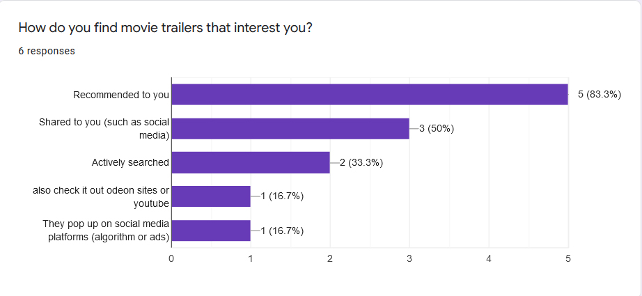
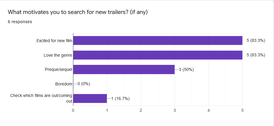
Above are some screenshot data from my Google forms questionnaire.
Pain Points
- Sometimes these trailers don’t have closed captions, and makes watching them more difficult. This paint point can be addressed by including closed captions, and other accessibility options.
- Some users felt overwhelmed by the choice of movies & trailers, and were often discouraged by it. We can address this pain point by recommending trailers to the user that fits their preferences.
- Users didn’t like the fact that they are often served ads when watching trailers. They preferred an ad free experience. We can address this pain point by not serving video ads, and exploring alternative methods for monetisation (if necessary)
User Personas
Drawing from the insights gathered during my initial user research, I proceeded to create two distinct user personas for the project. These personas enabled me to define the goals and frustrations that users might encounter.
Developing user personas proved to be immensely valuable in comprehending the challenges users may face when searching for a movie trailer. Moreover, they provided a deeper understanding of the emotions that users could experience throughout the process.
Armed with this understanding, I entered the ideation phase, leveraging the insights gained from the research. This informed and guided the design process, allowing me to tailor the design solutions to address the specific needs and preferences of the users identified in the personas.
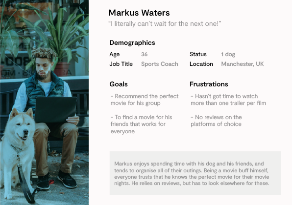
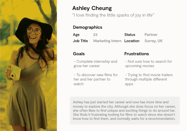
Two of the user personas created based on information gathered in interviews & surveys
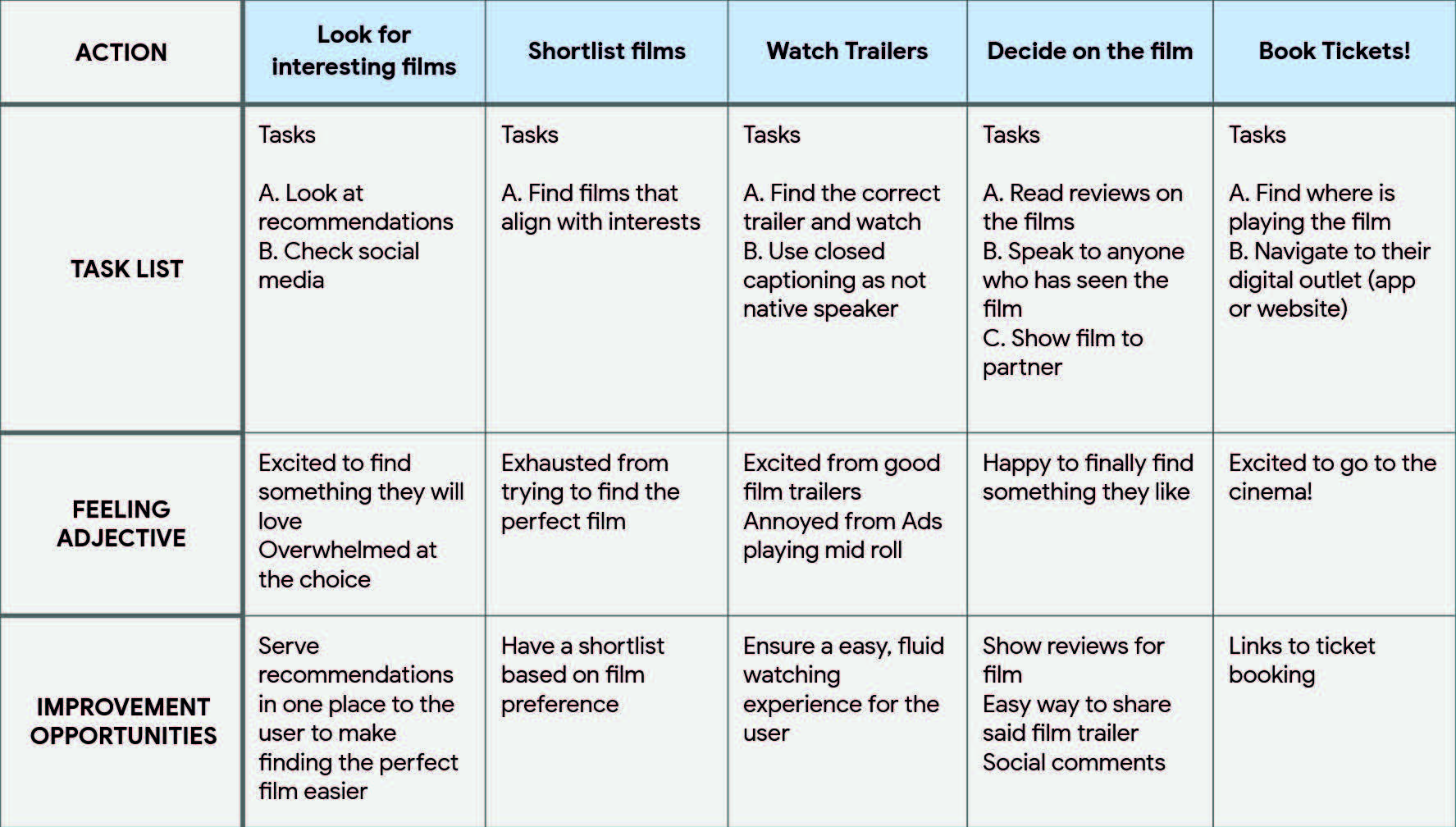
User Journeys
Utilizing the user personas mentioned earlier, I successfully mapped out a typical user journey. This journey provided valuable insights into the key steps involved in the user’s experience, as well as their emotional states at each stage.
By understanding the user journey, I was able to identify areas where improvements could be made. These opportunities for enhancement will be incorporated into the wireframing process, ensuring that the design addresses the user’s needs effectively and delivers an improved user experience.
Story Boarding
As part of the UX design course, we were assigned a task called “Big Picture & Close Up.” This exercise provided an opportunity to explore various ways of utilizing the app we were designing. In this exercise, I approached the task from two perspectives: the big picture and the close-up.
For the big picture perspective, I zoomed out and focused on the entire process encompassed by the app. This allowed me to consider the user journey as a whole, taking into account all the steps and interactions involved.
On the other hand, the close-up perspective directed my attention towards a specific, isolated step within the overall process. By narrowing my focus, I could delve into the finer details and intricacies of that particular step.
By undertaking both the big picture and close-up approaches, I gained a comprehensive understanding of the app’s functionality from both macro and micro perspectives, enabling me to design a more cohesive and user-centric experience.
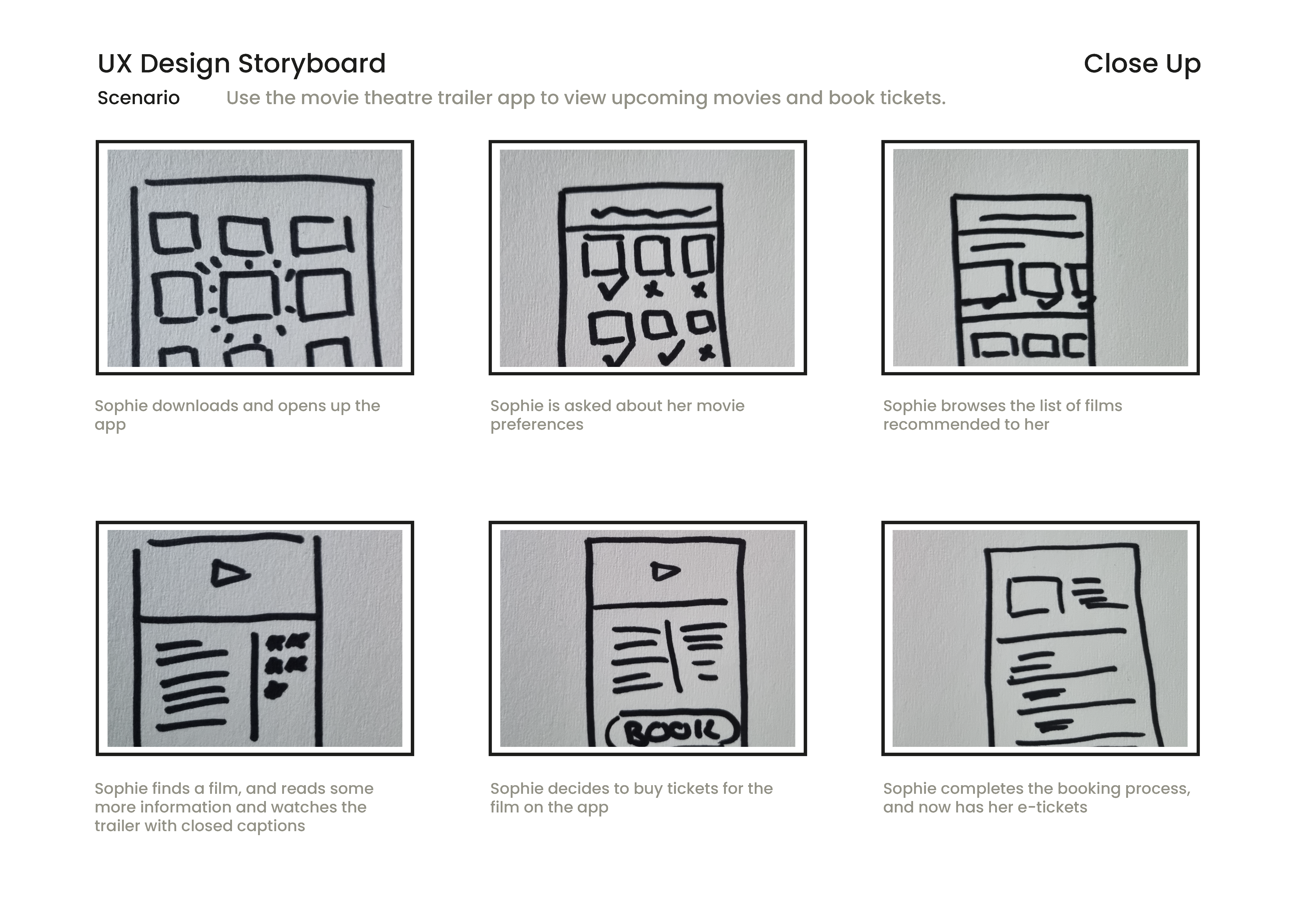
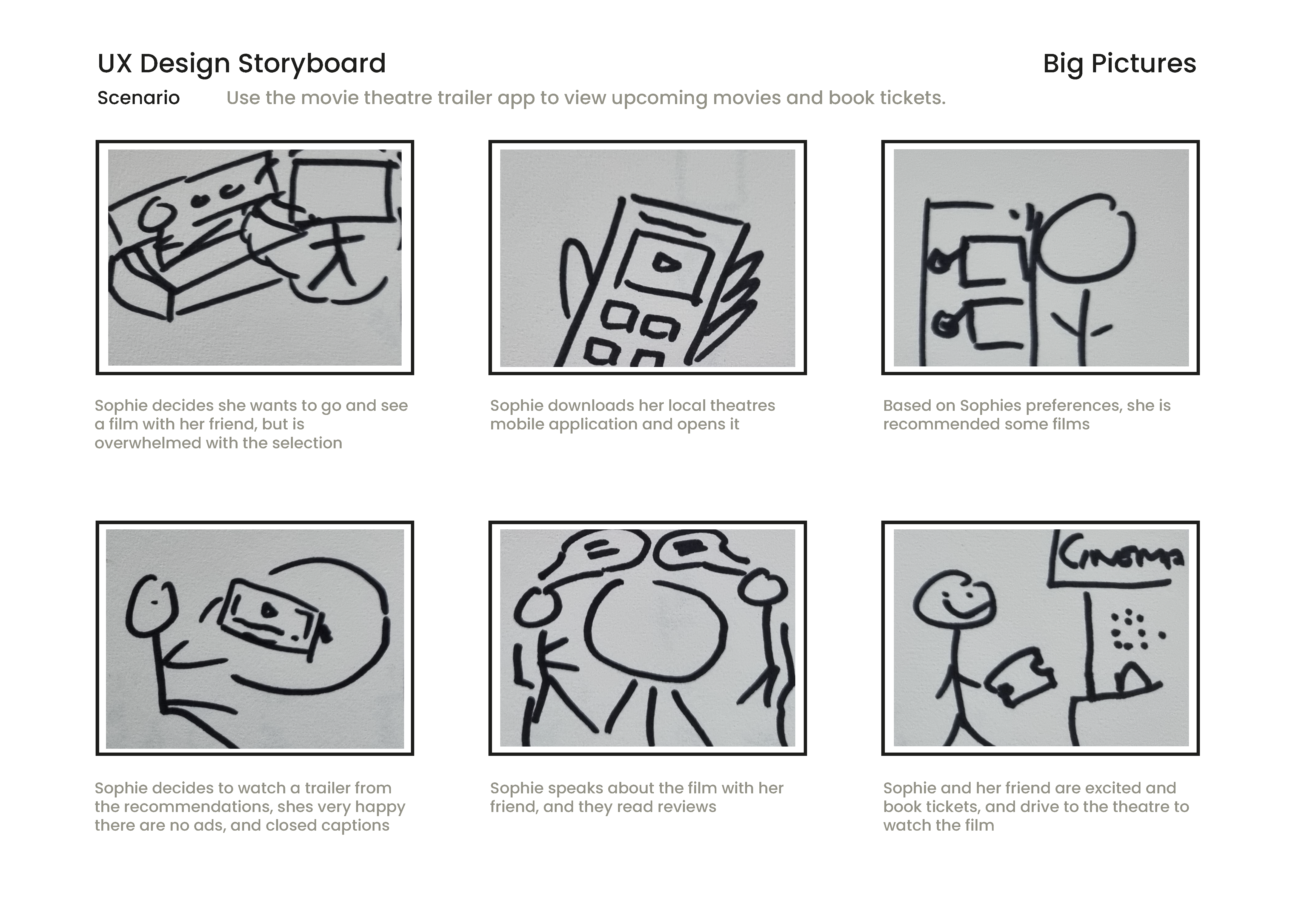
A close up and a big picture
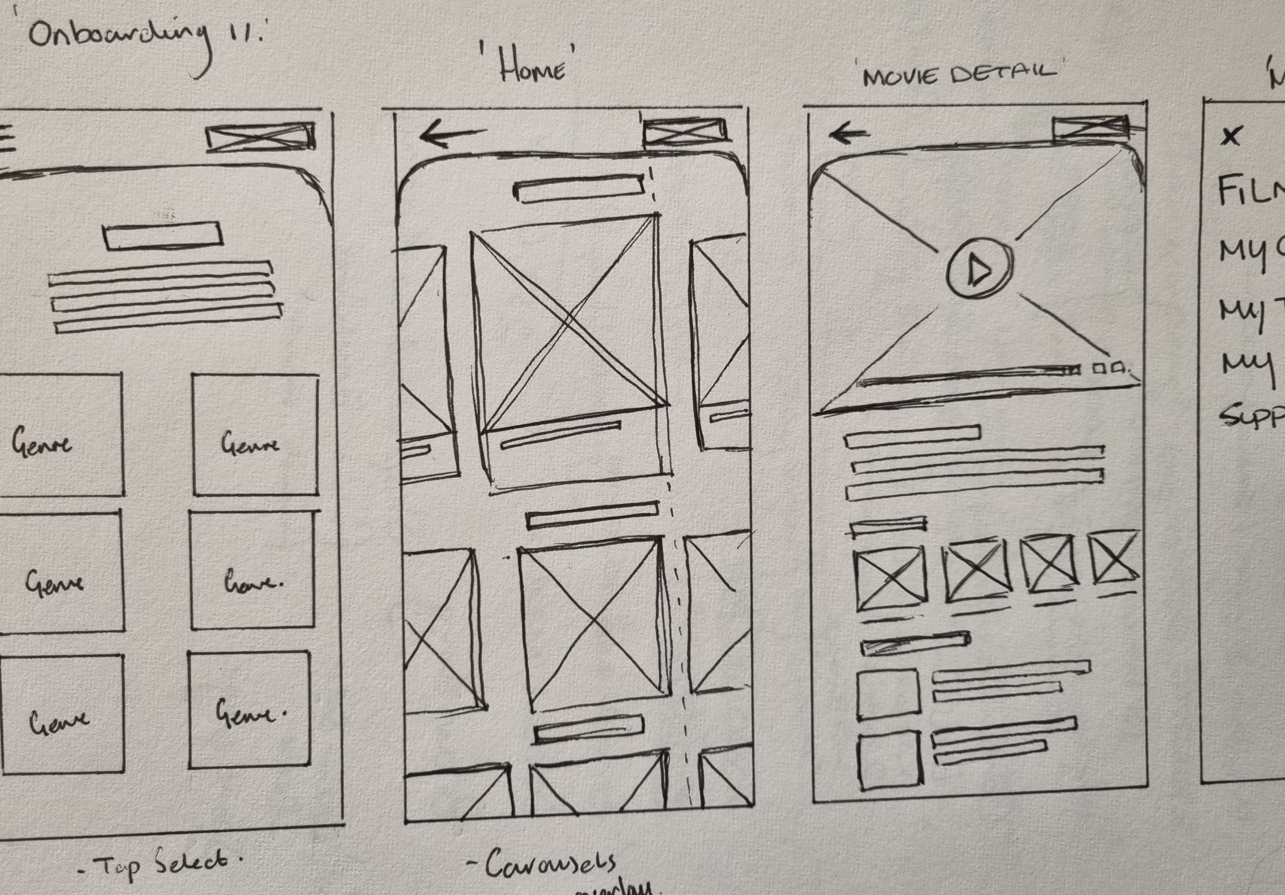
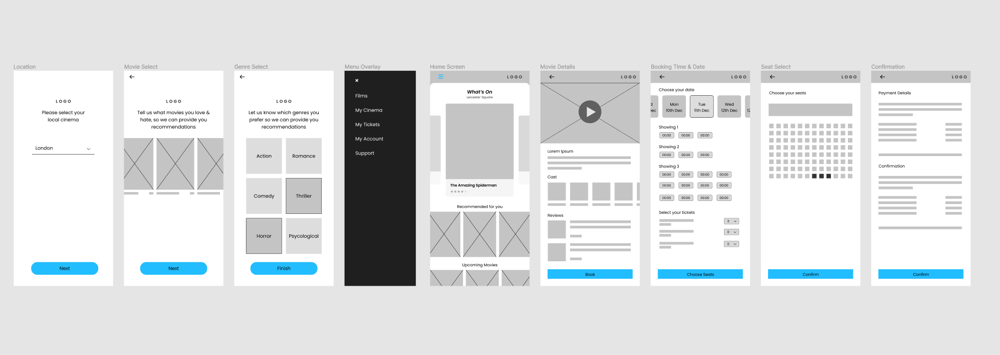
Paper Wireframes
After collecting a wealth of information during the initial stages, it was time to translate my ideas into tangible form through paper wireframe prototypes for the app design. In total, I crafted around 20 distinct paper prototypes. However, upon careful evaluation, I identified seven prototypes that particularly resonated with my vision and goals.
Out of the various iterations, these final seven wireframe prototypes stood out to me as the most promising and aligned with the desired direction. They encapsulated the essence of the design concept and represented a significant step forward in the design process. Thus, I decided to move forward with these selected prototypes as the foundation for further refinement and iteration.
Paper Wireframes
I scanned my paper prototypes into my PC and began creating some low fidelity wireframes from the concept ideas. As you can see a few things changed while creating the low fi wireframes such as shapes & spacing, however the core ideas remained. I linked up these first initial screens using Figma, which will allow me to do some quick user testing at this stage to get feedback on my initial ideas and design.
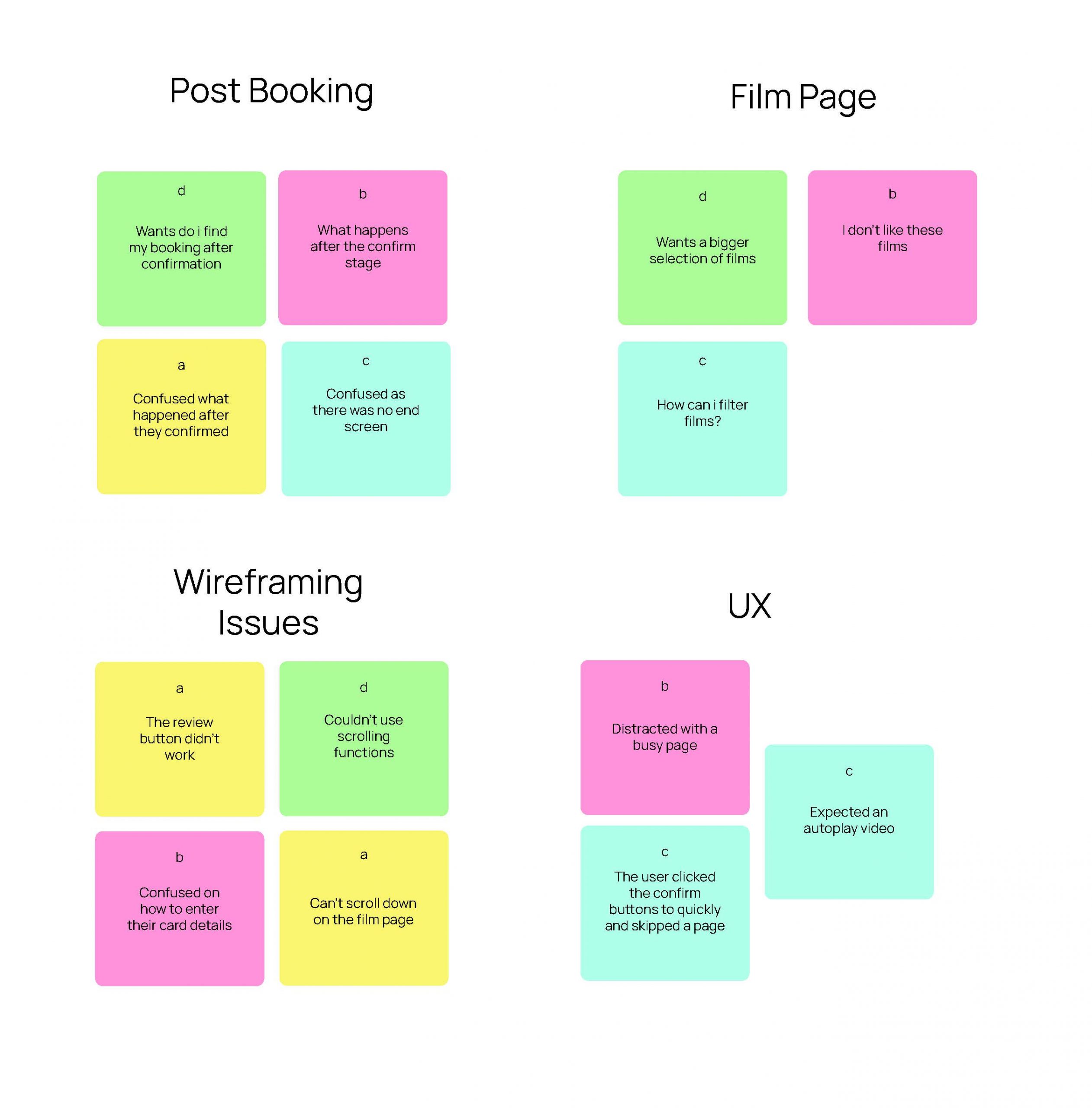
Testing Concepts
My goal for this research study was to see how well the prototype achieved its goals, and to see how users interacted with the prototype. I chose 4 of my friends who fit the criteria to undertake my usability test. I recorded their journey as i set them two tasks:
- Open the app and choose a movie trailer that looks
exciting. Watch the trailer & read some information and reviews - With your film now selected, book two tickets to see it at the
local cinema. Use the payment system using this card (hand fake card)
I was able to track the users click path, record their observations & quotes, and how easy it was to complete their tasks.
Pattern
It was observed that all participants were confused after booking. This means that the final stage of the booking process is confusing.
Insight
People expect direction after booking
Pattern
It was observed that all participants were confused after booking. This means that the final stage of the booking process is confusing.
Insight
People expect direction after booking
Pattern
It was observed that all participants had an issue with the wireframe. This means that our initial design wasn’t strong enough to user test
Insight
We should flesh out the wireframe more before testing.
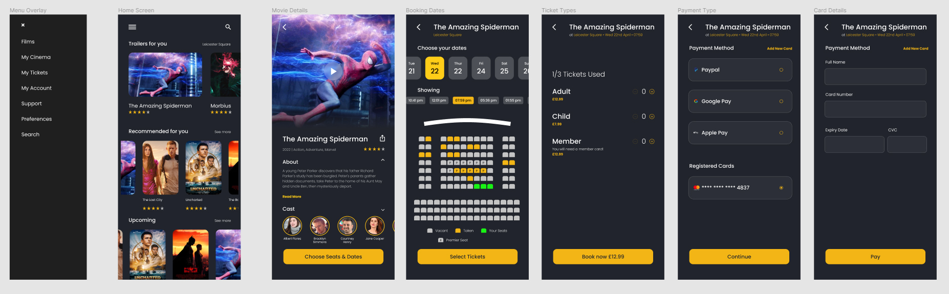
Refining Design
After receiving feedback from the first usability test, i had to revisit some parts of the designs. The most important feedback for me was the fact that users where intrigued by certain buttons which didn’t have accompanying screens. Therefore it left some users a bit annoyed that they couldn’t see a more whole picture.
Moving into the next phase, i wanted to flesh out the design a bit more, create a few more screens, and implement relevant feedback from the data gained.
I developed the high fidelity prototypes with the feedback from the usability test in mind. i created the screens using Figma & variants.
I found the flow of the app to be a lot more straightforward for the user, and they are now directed to their own payment and booking pages, and are directed to a new screen after the booking is complete.
I fleshed out the rest of the design, and created a small design system to use while designing the high fidelity prototype.
What i learned
As this was my first full project for a UX case study, i have learn a lot of invaluable information.
At the start, i thought that designing an app that has been designed before, and is a well documented application would be boring, and i would end up with a similar design to those. However, i learn that how you empathise with the user will really drive your design, and allow it deviate based on the questions you asked, and how you approached the problem
This was the first project i deep dived into Figma, and being so inquisitive lead me to gain a much deeper understanding of the program, learning variants and instances, and how powerful they are to create rapid prototypes.
I learn how to create and conduct interviews, and questionnaires, and how to really interact with people the right way in order to get clean data to design from.
All in all, I’m super happy that this was my first step into UX, and I know there is still much for me to learn in the field.