Aviation News Website

Overview
Role
Digital Designer
Tools
Adobe XD
Adobe Illustrator
Platform & Architecture
Includes
UI Design
Web Design
Application Design
Information Architecture
Background
Although the COVID-19 quarantine had people in low confidence (including myself) i found the time to pickup some new projects, and to learn more about the UI/UX design process. Having joined IDF, I’ve learnt a lot about the UX process, including the Double Diamond process and the Agile methodology. I would like to put some of the new concepts i learnt into practice throughout this process
EVA international is a media publishing company that provides daily news in different sectors of the Aviation industry. The company also publishes 4 magazines, it produces a podcast featuring key figures in the industry, and hosts events throughout the year.
I was employed at EVA international originally as a print designer. I slowly was able to transition into a generalist designer for the organisation. Over Covid, i asked my manager if i could use the website as a practice project for my UI / UX practice.
Problem
EVA international has a lot of content, and the general user experience is not really cohesive. They maintain 5 websites, and the way the information is delivered can be confusing. The design includes some outdated concepts, and lacks clear objectives.
EVA international has a lot of content, and the general user experience is not really cohesive. They maintain 5 websites, and the way the information is delivered can be confusing. The design includes some outdated concepts, and lacks clear objectives. Our goals are as follows:
- Create a more cohesive ecosystem for the EVA brands
- Create a more intuitive navigation system
- Deliver content concisely to the user
Analysis
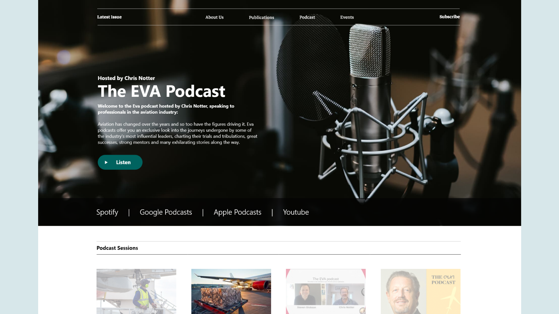
Currently, The EVA home website is currently more about the company. I want to repurpose this website to give it more meaning, and for users to have access to all parts of the website. Currently the highest viewed page on this website is the podcast. I believe we should also make this a much more prominent part of the homepage, so people are easily directed to it.
- Real Estate is important.
The header could make better use of the space. the social media icons can be moved, and the phone number is not that important – i believe remaking this section will be the key to solving our 3 main problems. - Show, not tell.
Instead of telling the user what we do, i think it is more effective to show them. This means showing our latest news stories, and advertising the podcast. - Stay true to the brand.
The individual websites for the publications should lean more on the EVA brand. Right now they look like separate entities. Having them all draw from the same guidelines will satisfy our first problem.
By making use of the EVA page, we can use the power of the podcast to drive the brand forward, and also incentivise users to explore other EVA content.
EVA is currently a 2 page website. The homepage consists of 6 sections which are all located on the same page. I think the website would benefit from splitting up each of these subcategories, and using the homepage as a content hub for the magazines.
Navigational Analysis
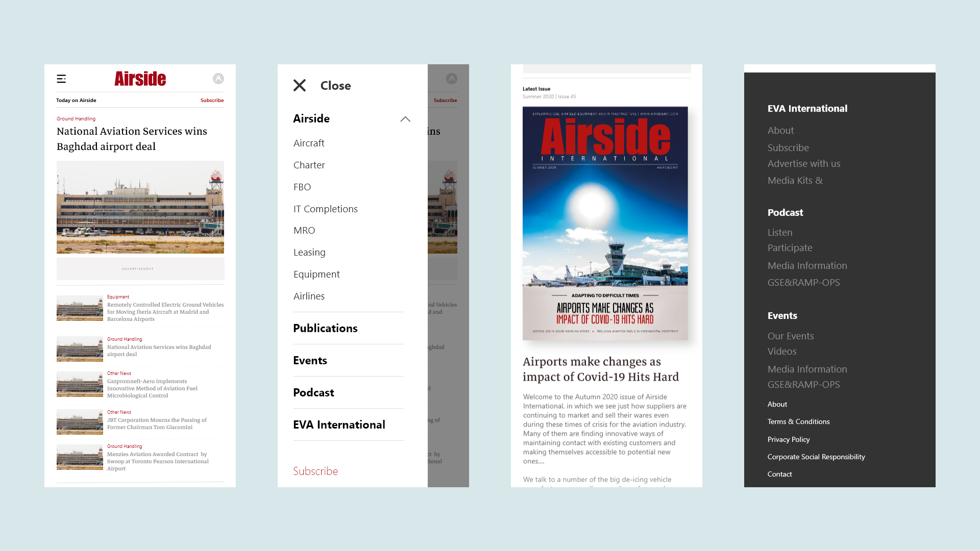
I realised, after looking at the navigation for both the publication pages, and the EVA homepage, that there is a crossover of 7 categories. This is helpful if we wish to consolidate these pages, and make an ecosystem between the pages. I have decided to create a global menu and a local menu, which will service for all 5 pages. the local menu will change depending on the publication, which will have all of the news categories. the global navigation will contain all of the information that is shared between the websites.

Google Analytics Behavioural flow – showing how users navigate through the website, and where the drop-offs are
Data Review
I was able to get some analytical information for my case study relating to one of the main news websites. What I really wanted to see was the behavioural flow connected to the website. I wanted to see how the users were travelling through the site, and see what conclusions i can take from that. (this data was taken over the course of 1 year Apr 19’ – Apr 20’.)
From the homepage, we can see there is about 50,000 drop offs, which accounts of 90% of traffic. This is alarming. I believe the user is not being directed around the website conveniently or efficiently.
The first most popular interaction is straight to the “all news page”. This immediately lets me know that people come to the website first and foremost for news.
The most popular second interaction is back to the homepage. This is interesting, and here’s how I interpret it:
- The users can only get to where they want from the homepage
- Users are confused as to where to go next, so default back home.
The second most popular interaction is the news archive page. I wanted to understand how important the news archive page was, and why users wanted to go there.
The button “News Archive” is at the bottom of the page, therefore may be mistaking it for “more news”
As we continue, we can see a pattern of people bouncing between news archive, all news, and the homepage. Although there are categories in the sub menu, the users are not using them. Either they are not obvious in there function, or the categories are not sparking a chord with the user. Either way, i believe a heuristic approach to the navigation will help alleviate user flow frustrations.
Further Investigation
To look into this further, i would require more data – maybe from the other news websites to see what information correlates to what information differs. I would also like to do some research into average drop off rates from the homepage, to see if this behaviour is standard, or there is something very wrong.
Information Architecture
To see if we could simplify the navigation, i decided to do a card sorting (open & moderated). This gave me positive results, and helped me design a much better navigation. I saw there was so much overlap in the menu items that it helped me condense the menu to something more accessible.
I used the card sorting method to create a the sitemap that you see below. I ended up having a local menu and a global menu, which had the correct menu items in each.


I held a card sorting sessions internally using a free tool with Maze. With the 8 responses, i organised the data into a tree map.
Low Fidelity
Armed with my findings, i took to paper prototypes to start getting some ideas about how to structure the news layouts. i went through 6 different ideas before landing at a concept which i think worked. Once i had a paper wireframe i was happy with, i took it into Adobe XD, where i made low fidelity wireframes. This helped me understand how the content was going to work, and it also helped me show EVA International how the website would work. I did some user testing with some of the staff at the time, and got some initial feedback.


A selection of low fidelity screens I had created to help me structure the new website design
Low Fidelity
Armed with my findings, i took to paper prototypes to start getting some ideas about how to structure the news layouts. i went through 6 different ideas before landing at a concept which i think worked. Once i had a paper wireframe i was happy with, i took it into Adobe XD, where i made low fidelity wireframes. This helped me understand how the content was going to work, and it also helped me show EVA International how the website would work. I did some user testing with some of the staff at the time, and got some initial feedback.
The Solution

Some screenshots of the MVP solution to Supplier Vetting. including the “Back Office” using Components from the global library. Some screens have been excluded to protect valuable company information or strategy