This project kicked off with the product team looking at which features we can migrate from our legacy system to our newer platform. The previous version of the analytics dashboard wasn’t the most effective way of serving data to the user, so we took the time to analyse the current, speak to current users about their experience with the dashboard, and create a plan of how we wanted to implement an updated version.
Since the scope of this project was quite broad, and involved lots of different types of users, it was important to gather requirements for each user base, along with other information i needed to ensure the design worked for our users and the business.
The Process
Discovery
I kicked of this project by getting very familiar with the current implementation. I set myself some tasks to do, and I recorded my findings. These task included:
How many leads did i receive in 20xx?
How did my leads differ from 20xx to 20xy?
Who was my most valuable customer?
How much money have i made on the platform?
This helped me put myself in the users shoes, and think about navigating the platform in a certain way. It also helped me identify some things that I found problematic with the current implementation. Whilst this was not a replacement for speaking to users, it serve as an aid to give me context while understanding how they potentially will consume the data.
What I identified
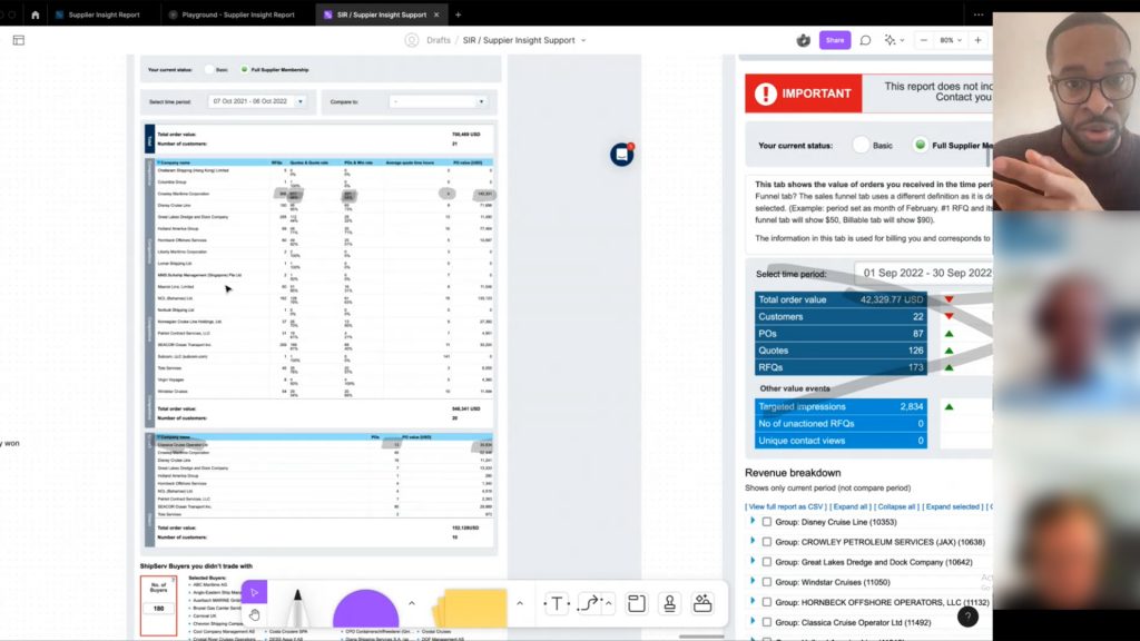
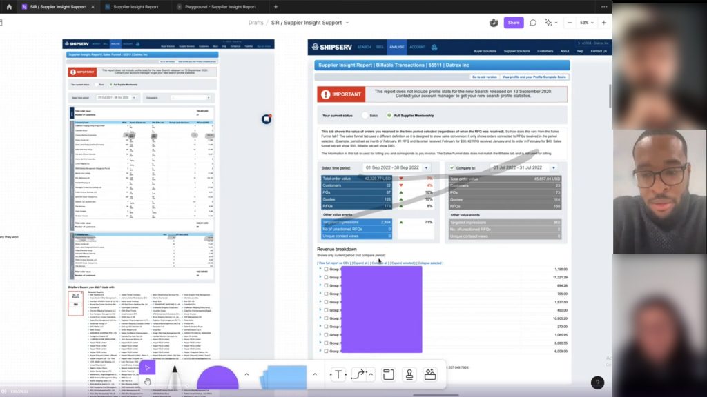
Comparing dates is unintuitive. Adding a secondary date range just duplicates the data underneath. This means I have to scroll up and down to compare data from two different dates.
Lack of visual hierarchy makes finding important data points difficult.
Some conflation of data occurs, which mixes advertising and transaction data.
With some more discovery to do, i setup a few interviews with current users of the dashboard to get an insight into their thoughts and feelings while using it.
I created some specific research goals for the interviews:
Understand how users feel about the SIR report Do users actually want this?
Discover how people are currently using the legacy tool? What are they using the tool for primarily? This will help me understand what users regard as important.
What features the users would like to see in the analytics dashboard? How can we improve the current dashboard? How do we want to improve the user experience?
What are the current frustrations and pain points of the current implementation? What do the users find annoying in the tool? this could help us identify points of improvement.
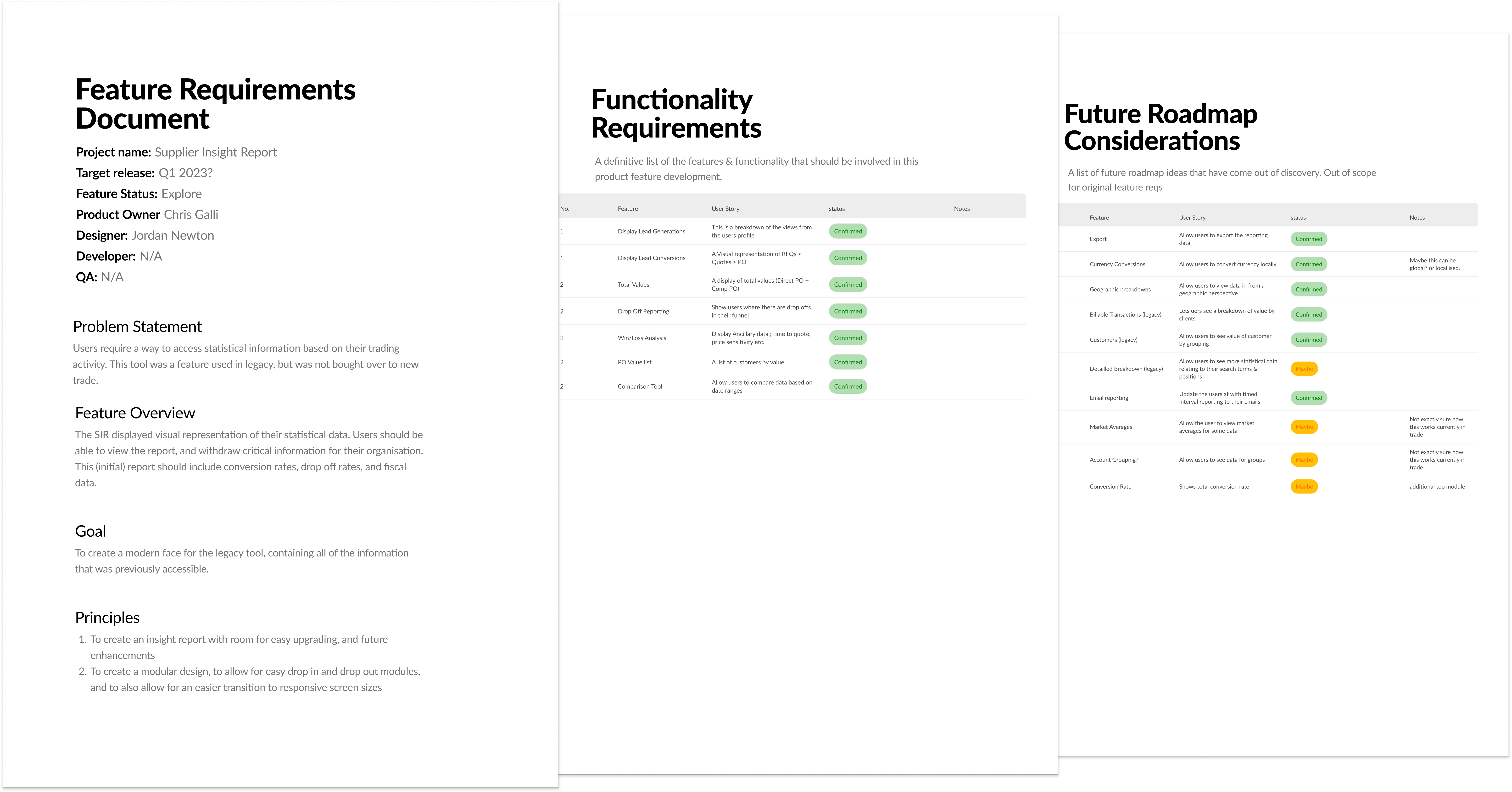
This was one of the initial PRD’s i had created. This document grew to become the ShipServ PRD.
Screen captures of some of the interviews i conducted surrounding the alegacy nalytics dashboard. (uploaded & analysed in DoveTail)
Definition
I was able to confirm some of my assumptions for this project, but also uncovered some information that would inform the design outcome for this project. Some of the main topics that came up:
Users want to be able to drill down into the numbers. This would give them greater control of the data
Comparing information is difficult, and users cant use this version of the dashboard to contribute toward reports
Clear usability issues for the users, can’t find some information, or some information is not labelled correctly.
Armed with some insights about the project, and information from the clients, as well as lots of stakeholder and internal meetings, i can finally create some specification documents around the project.
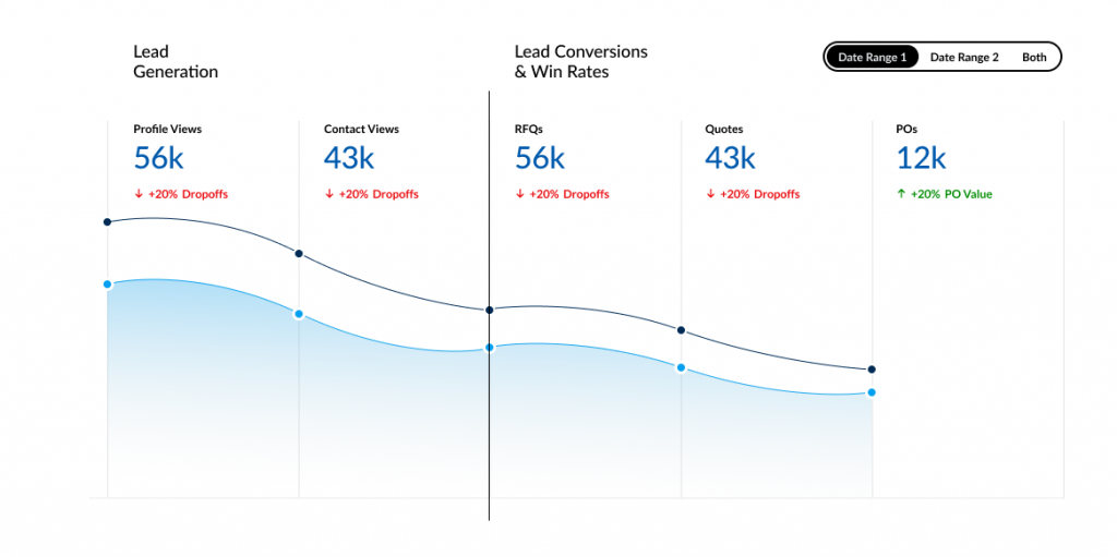
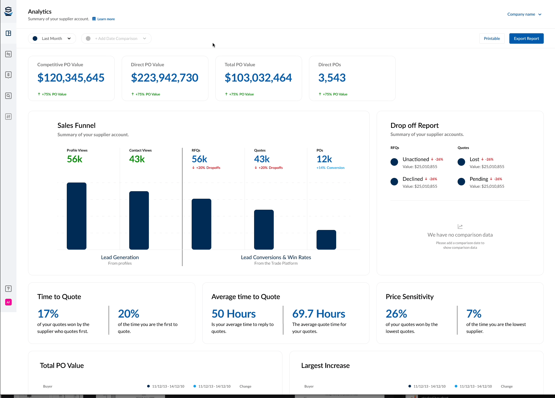
This project will consist of three dashboards, which will carry over all of the information from the legacy system. This way the information will be more organised and will make it easier for the users to find what they are looking for.
We will create a new way for users to compare their data, giving them the option to choose two date ranges. This will allow the user to compare data effortlessly.
We will need to design some new components to be able to handle some of the requirements. I decided to create a few design philosophies for this project:
Dashboard should be evolutionary – we should be able to add, remove, and update the dashboard in a way that allows for easy expansion & contraction.
Users should be able to export any date range of information, as this is important for them to be able to manipulate for their own recording
Dashboard should be accessible on multiple formats
The PRD (Products requirement document) was a process I introduced to the organisation. It helped us gain requirements from the product owner, and get cross functional alignment on the justification for the project. We continue to use PRD’s for all projects involving UX.
Ideation
I began to iterate through some design ideas around the information architecture, data visualisation methods, component design, functionality & interactivity.
With regular stakeholder meetings on my progress, we had made some design decisions and scoping decisions which bought us closer to the initial version of the product.
With an initial design, we were able to get some feedback from customers and internal stakeholders alike, and make any changes that make sense.
Exploring some Data Visualisation options
Iteration
I began to iterate through some design ideas around the information architecture, data visualisation methods, component design, functionality & interactivity.
With regular stakeholder meetings on my progress, we had made some design decisions and scoping decisions which bought us closer to the initial version of the product.
With an initial design, we were able to get some feedback from customers and internal stakeholders alike, and make any changes that make sense.
Trying to ideate a solution to this problem took way longer than i had imagined. There was a lot of internal conflict about what is the “right” solution. Therefore, i needed to create a solution which would satisfy both parties.
We had gathered some information for our initial design, and we had two major changes at this point.
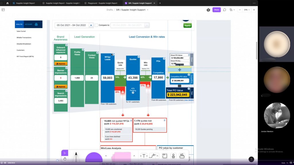
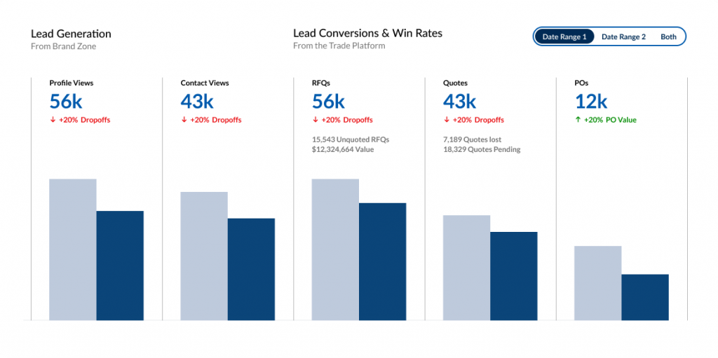
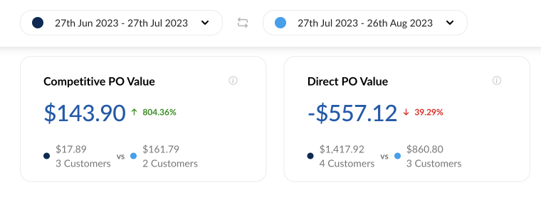
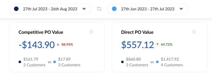
How the comparison is made
We came across an interesting objection here, which is when you add a date of comparison, do you compare the earliest date to the latter, or do you compare the default date, to the second date picked (even if the date itself is before or after the original date range)
This was a huge pain point for some, and an absolute non issue for others. I hadn’t really considered this point in design, as it made more sense to me to compare the first date to the second. However, i suggested a way for the user to swap the date ranges. This gives the user away to see both comparisons, regardless of which date was before or after.
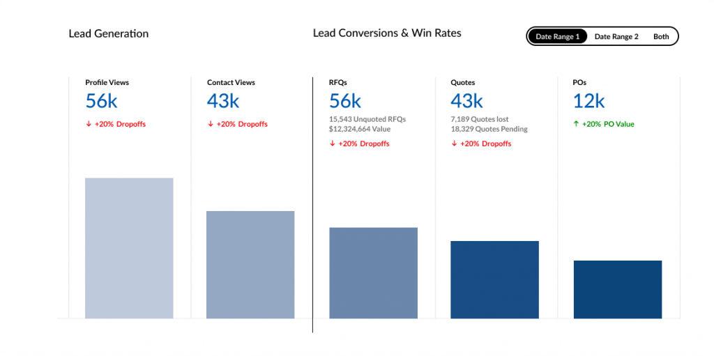
Choosing the prominent number
In design phase, i had used the percentages to be the prominent figure in the modules. Our feedback had suggested that seeing the dollar value instead of the percentage value made more sense. There was a quick solution here, and that was to switch the dominant value.
Moving on
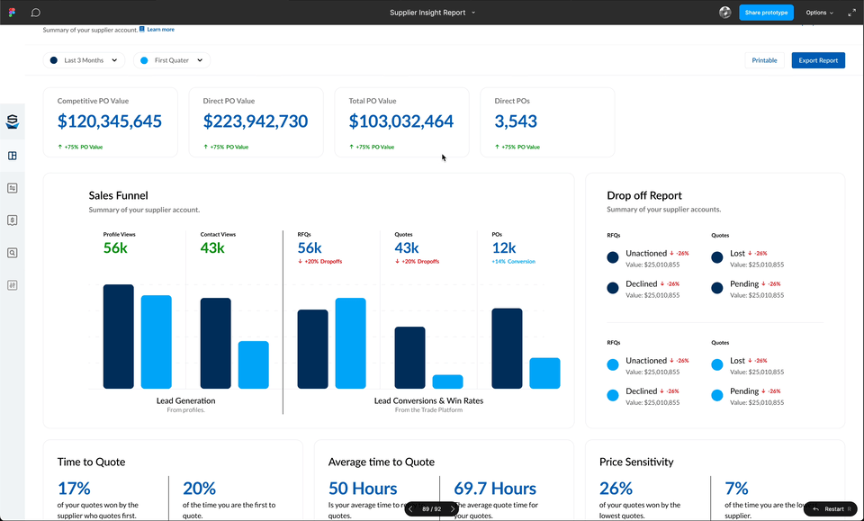
I moved into iteration phase for the additional dashboards. We were able to use the design patterns created for the initial report.
A gif of the date picker for the dashbord report
Illustrating how having the same dataset can give different results based on the mode of comparison
Iteration
I began to iterate through some design ideas around the information architecture, data visualisation methods, component design, functionality & interactivity.
With regular stakeholder meetings on my progress, we had made some design decisions and scoping decisions which bought us closer to the initial version of the product.
With an initial design, we were able to get some feedback from customers and internal stakeholders alike, and make any changes that make sense.
Trying to ideate a solution to this problem took way longer than i had imagined. There was a lot of internal conflict about what is the “right” solution. Therefore, i needed to create a solution which would satisfy both parties.
We had gathered some information for our initial design, and we had two major changes at this point.
How the comparison is made
We came across an interesting objection here, which is when you add a date of comparison, do you compare the earliest date to the latter, or do you compare the default date, to the second date picked (even if the date itself is before or after the original date range)
This was a huge pain point for some, and an absolute non issue for others. I hadn’t really considered this point in design, as it made more sense to me to compare the first date to the second. However, i suggested a way for the user to swap the date ranges. This gives the user away to see both comparisons, regardless of which date was before or after.
Choosing the prominent number
In design phase, i had used the percentages to be the prominent figure in the modules. Our feedback had suggested that seeing the dollar value instead of the percentage value made more sense. There was a quick solution here, and that was to switch the dominant value.
Moving on
I moved into iteration phase for the additional dashboards. We were able to use the design patterns created for the initial report.
Testing
Testing
We had identified 3 clients that would help us testing the supplier insight report. I had asked these clients during the user research if they would be available to test the feature that their feedback had informed.
I created a few test scenarios for the users to try the new insight report, which included them navigating to the report, choosing a specific reporting date, and updating the filtering.
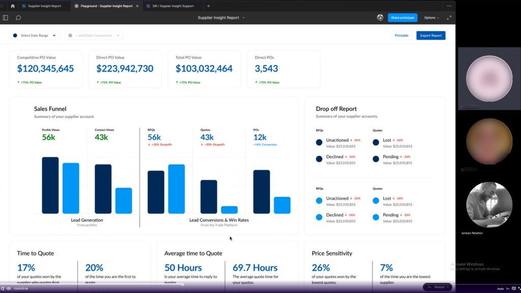
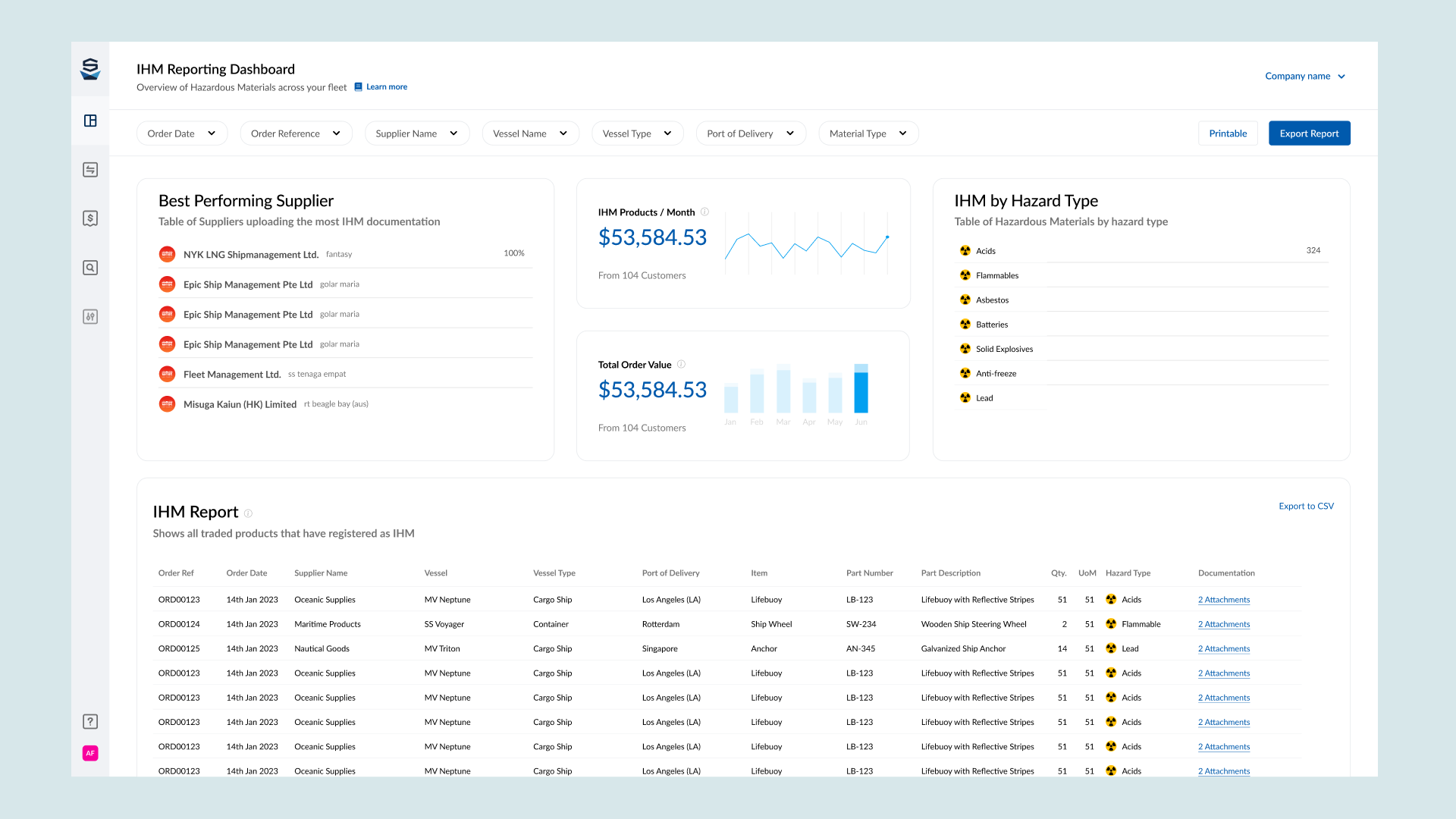
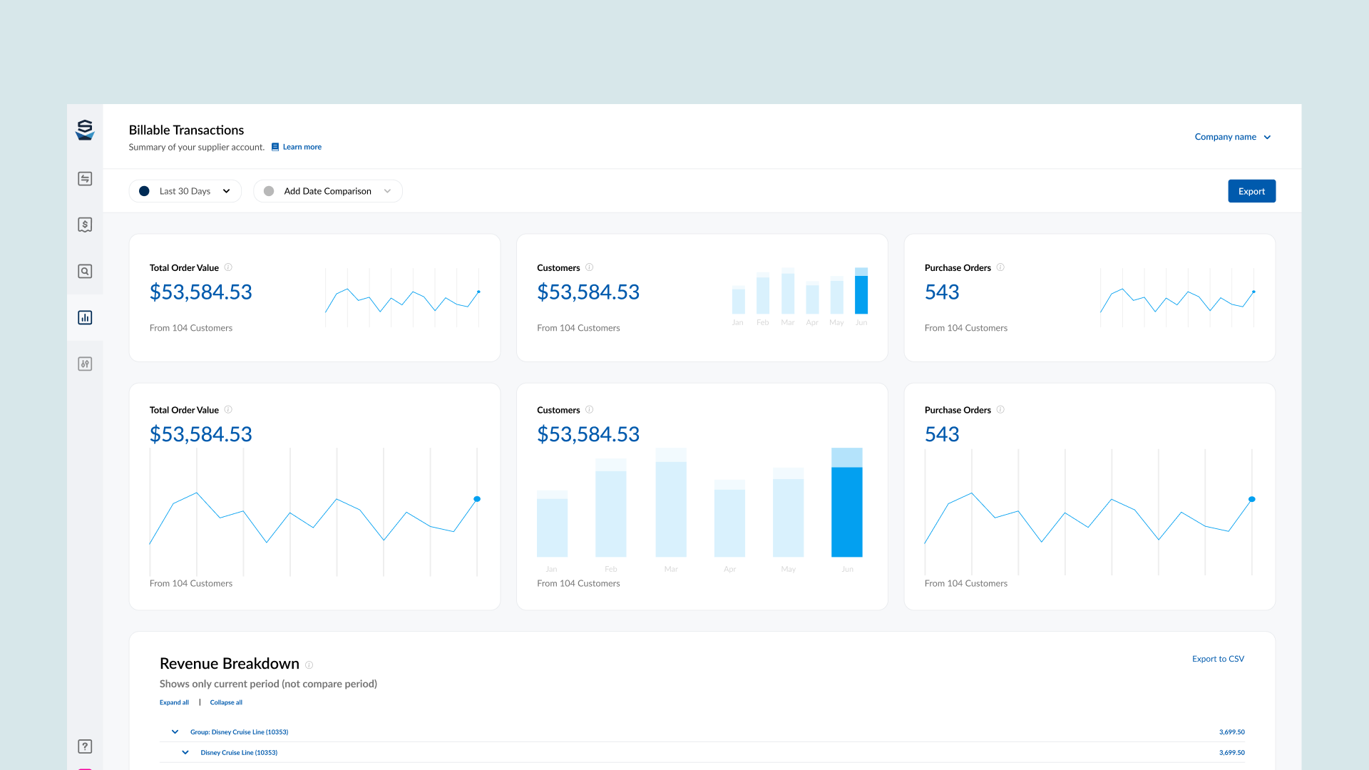
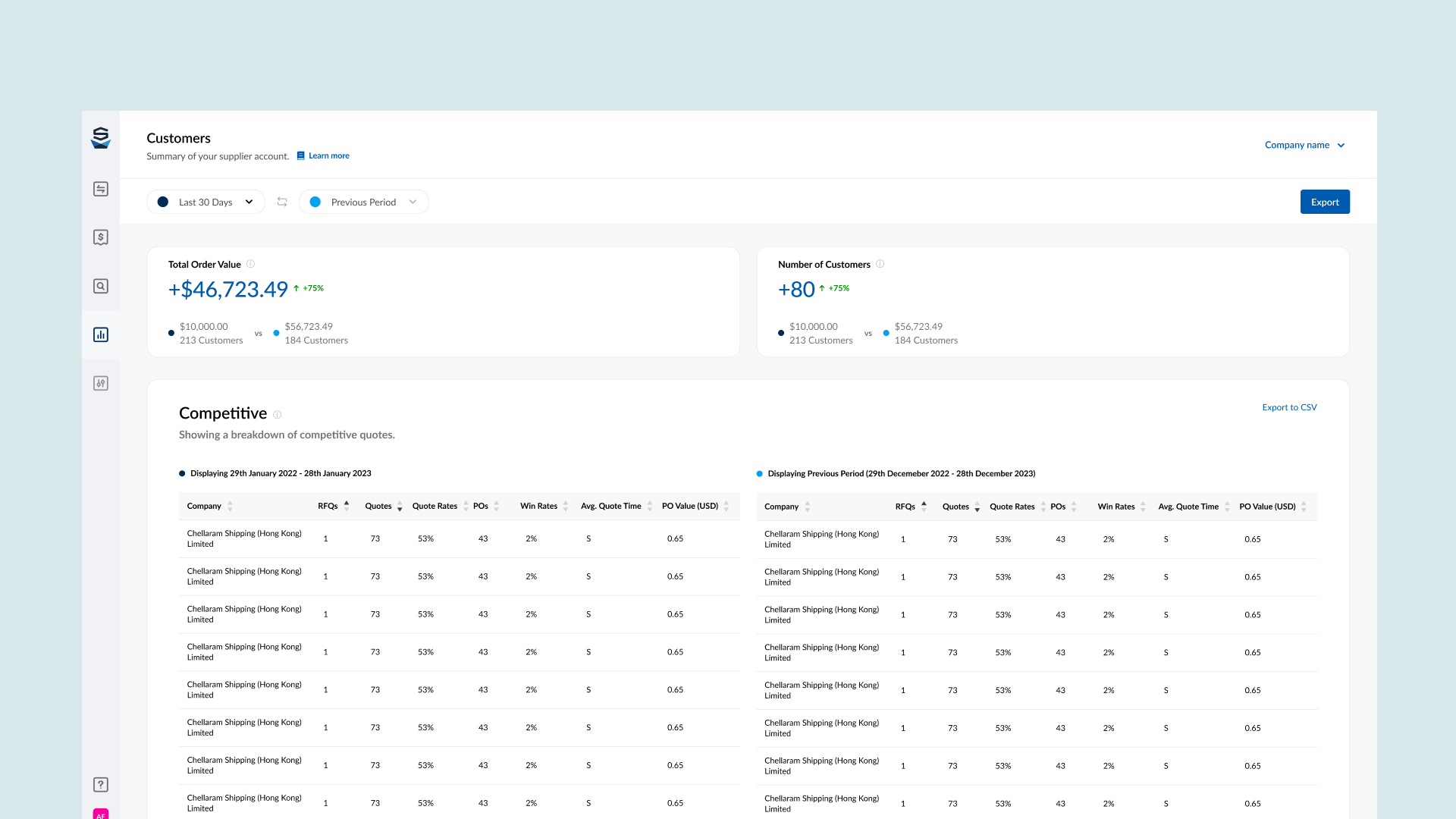
The Solution
Some screenshots of the MVP solution to Supplier Vetting. including the “Back Office” using Components from the global library. Some screens have been excluded to protect valuable company information or strategy
Defining Success
Data
With development starting on this project, i requested we record specific data points, so we can learn a bit about our users who use this feature, and also to start capturing our own analytical data. I requested the data team look at the following data points:
Time on Page
Comparisons made vs Non-Comparisons
Which information bubbles have been clicked
Returning Customers
Popular date ranges
Asking for such data actually prompted another project which i was part of – Setting up Google Analytics & Google Tag Manager platform wide. We added another section to our project goals called “UX metrics” where we were able to request which data points we would like access to for any project.
With development starting on this project, i requested we record specific data points, so we can learn a bit about our users who use this feature, and also to start capturing our own analytical data. I requested the data team look at the following data points:
Time on Page
Comparisons made vs Non-Comparisons
Which information bubbles have been clicked
Returning Customers
Popular date ranges
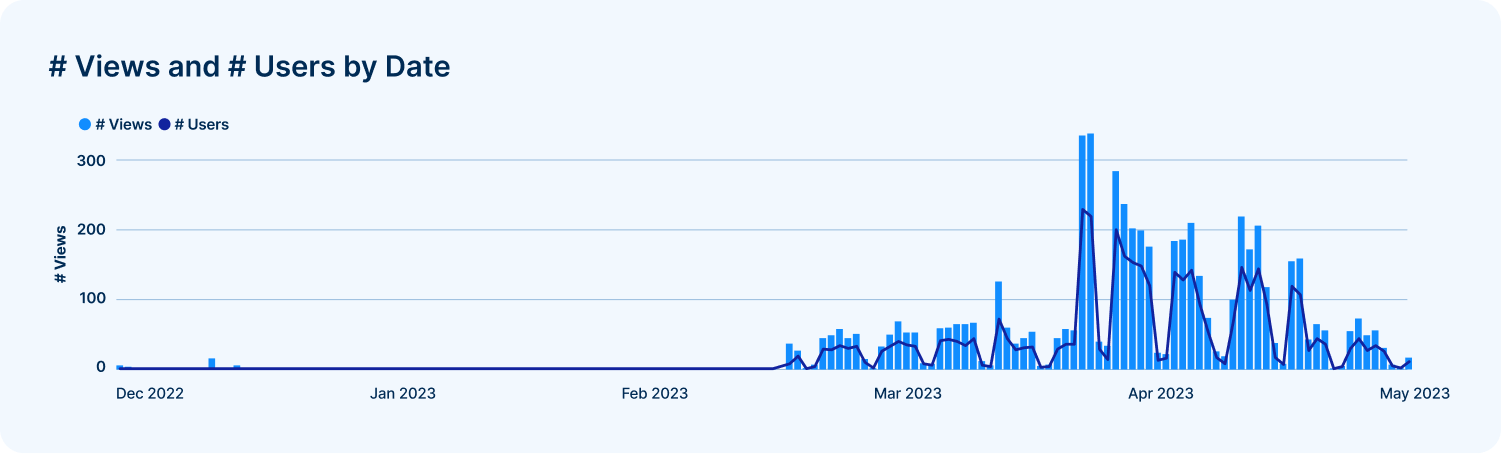
Viewing an uptick in users using the Supplier Insight Report (This is a portion of actual data)
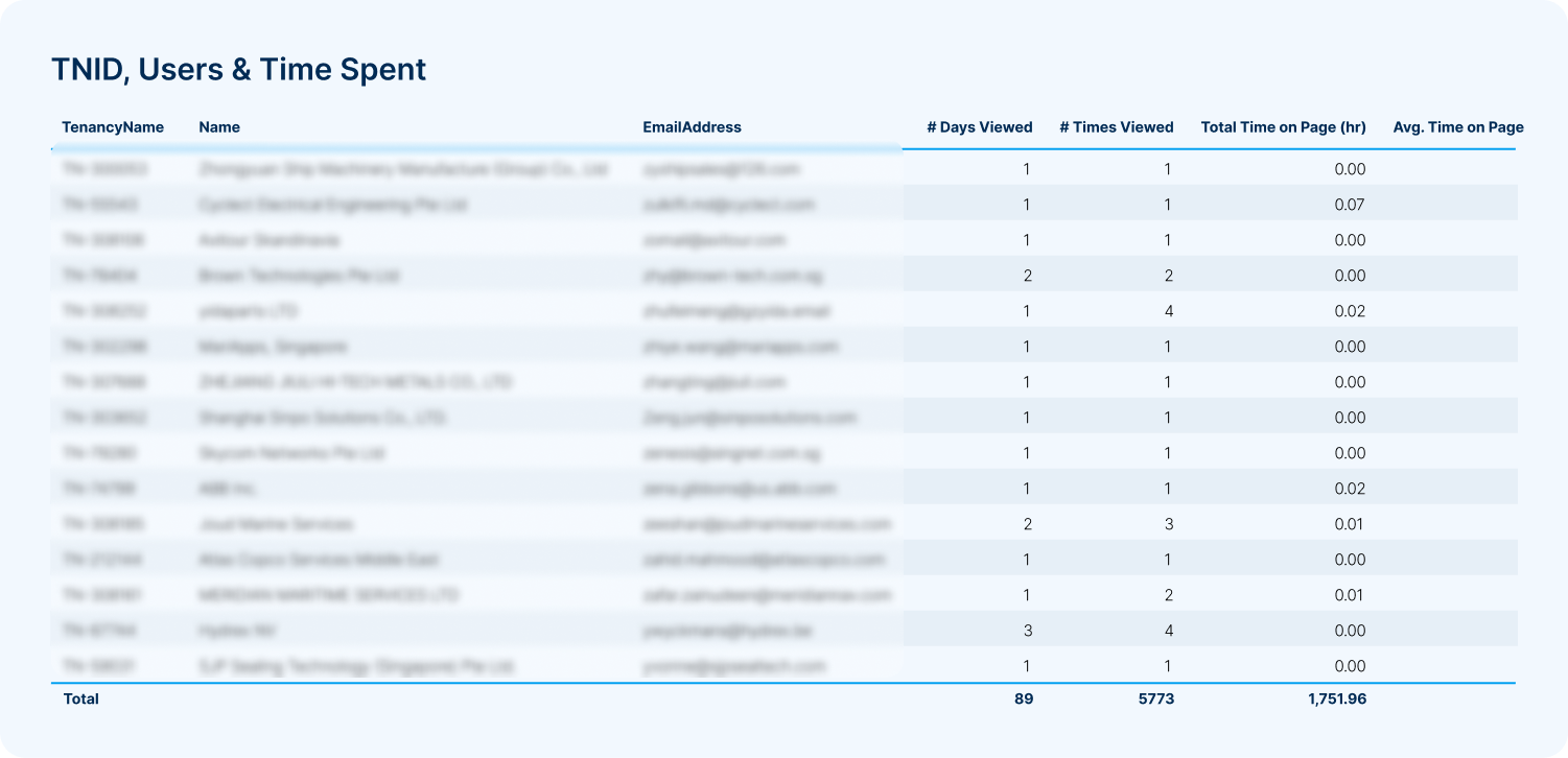
Viewing which companies are interacting with the report (This is a portion of actual data)
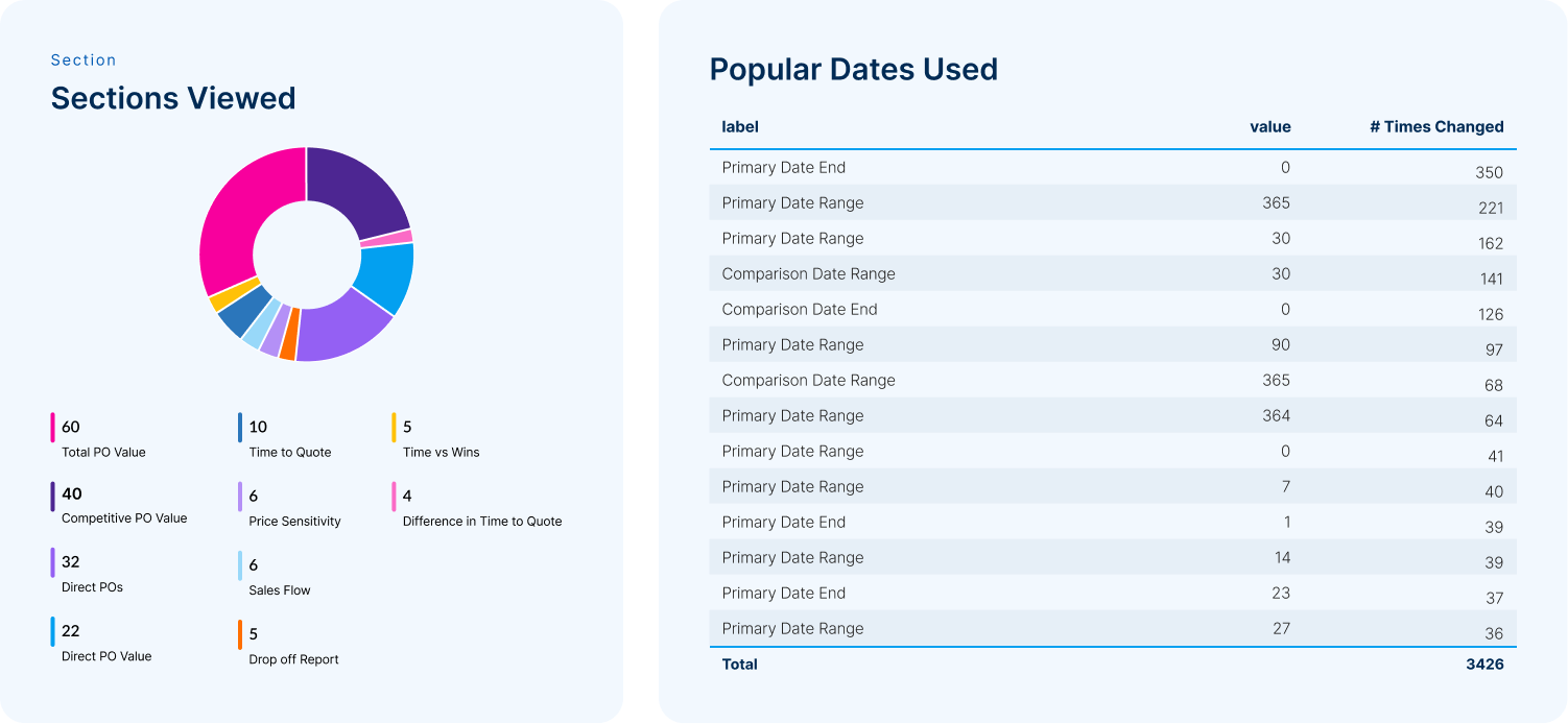
Which sections are interacted with the most, and what date ranges are being used for comparisons (This is a portion of actual data)
Thoughts
Learning
I learnt a great deal throughout this project. There was a lot of technical knowledge i had to gain to create something feasible. The user insight was the most valuable part of this project, as with large platforms, every user uses it in slightly different ways. If i could go back, i would campaign harder for more user validation for the latter reports in this project.
Say Hello.
Use this form to send me a direct message, or use the contact links below.